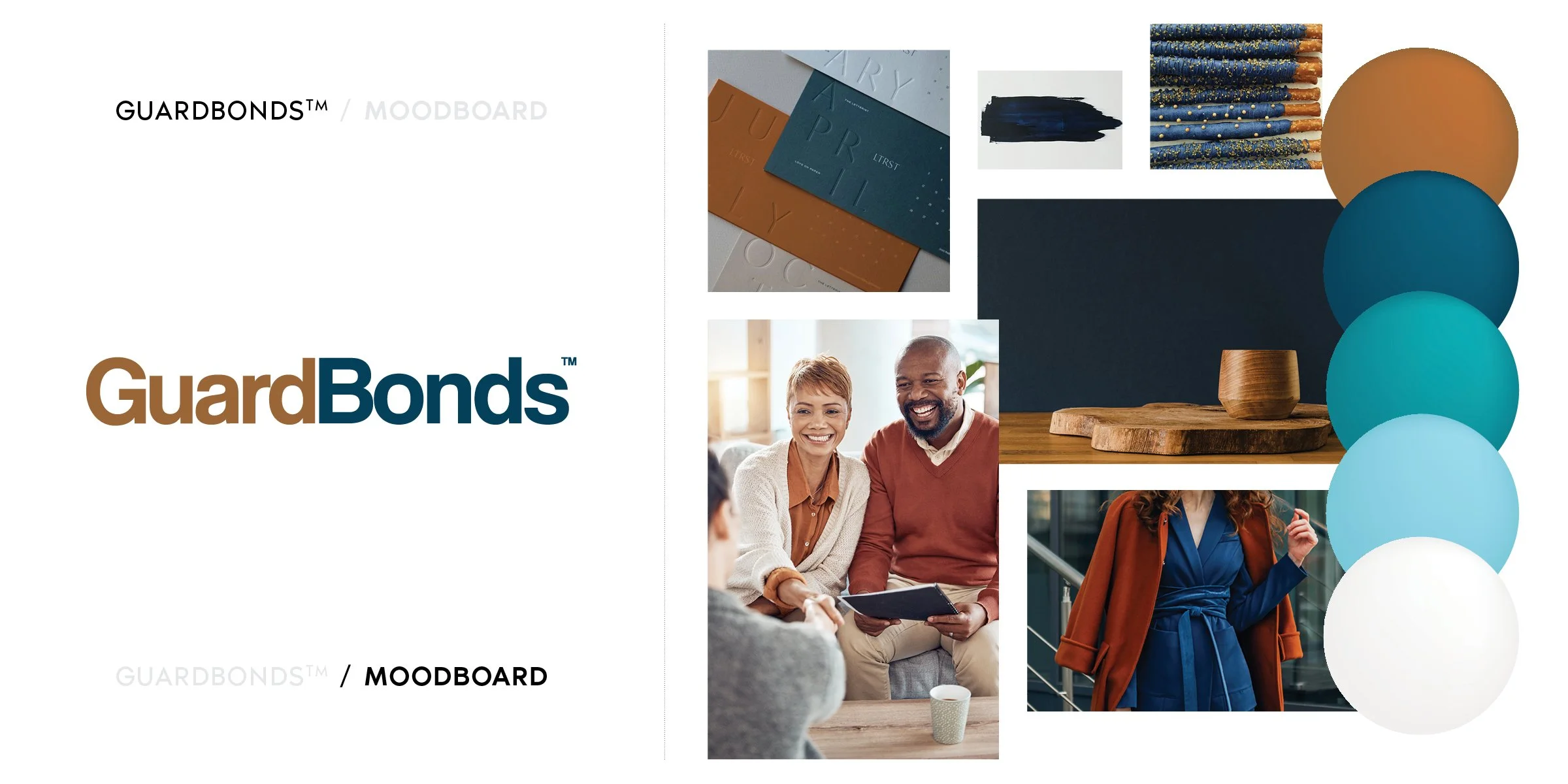
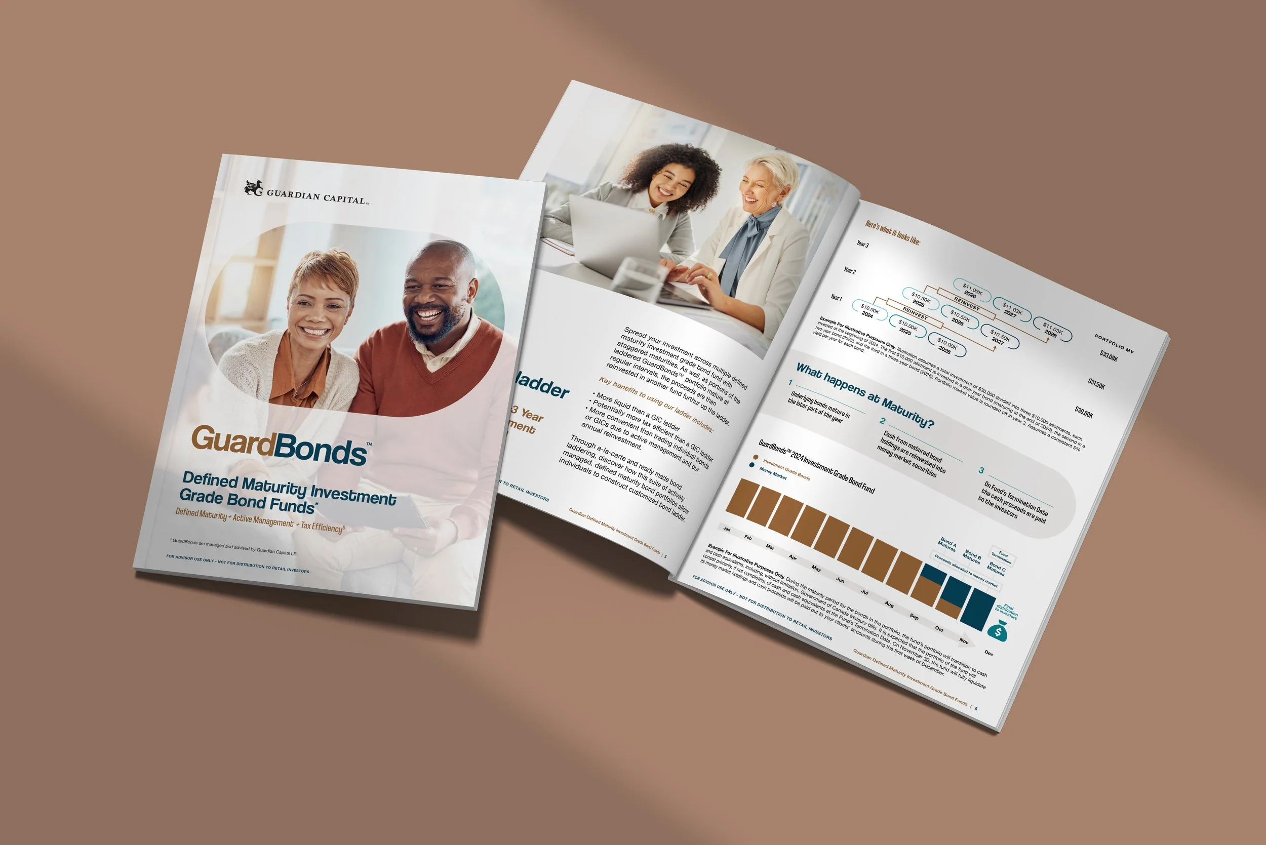
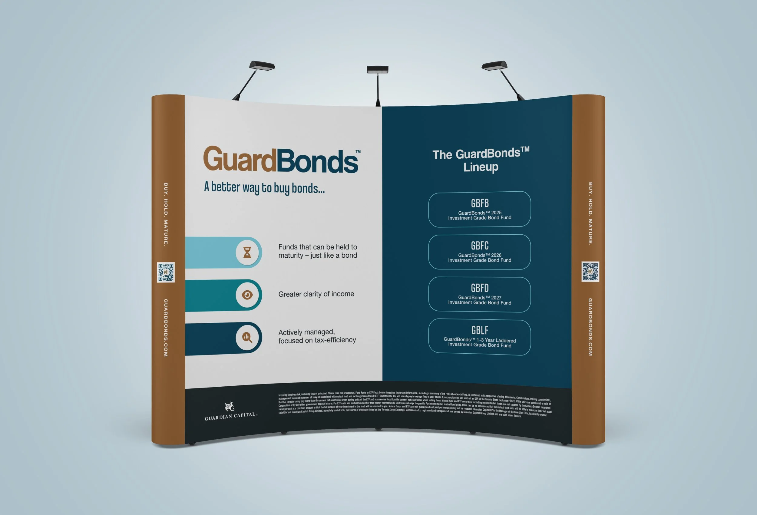
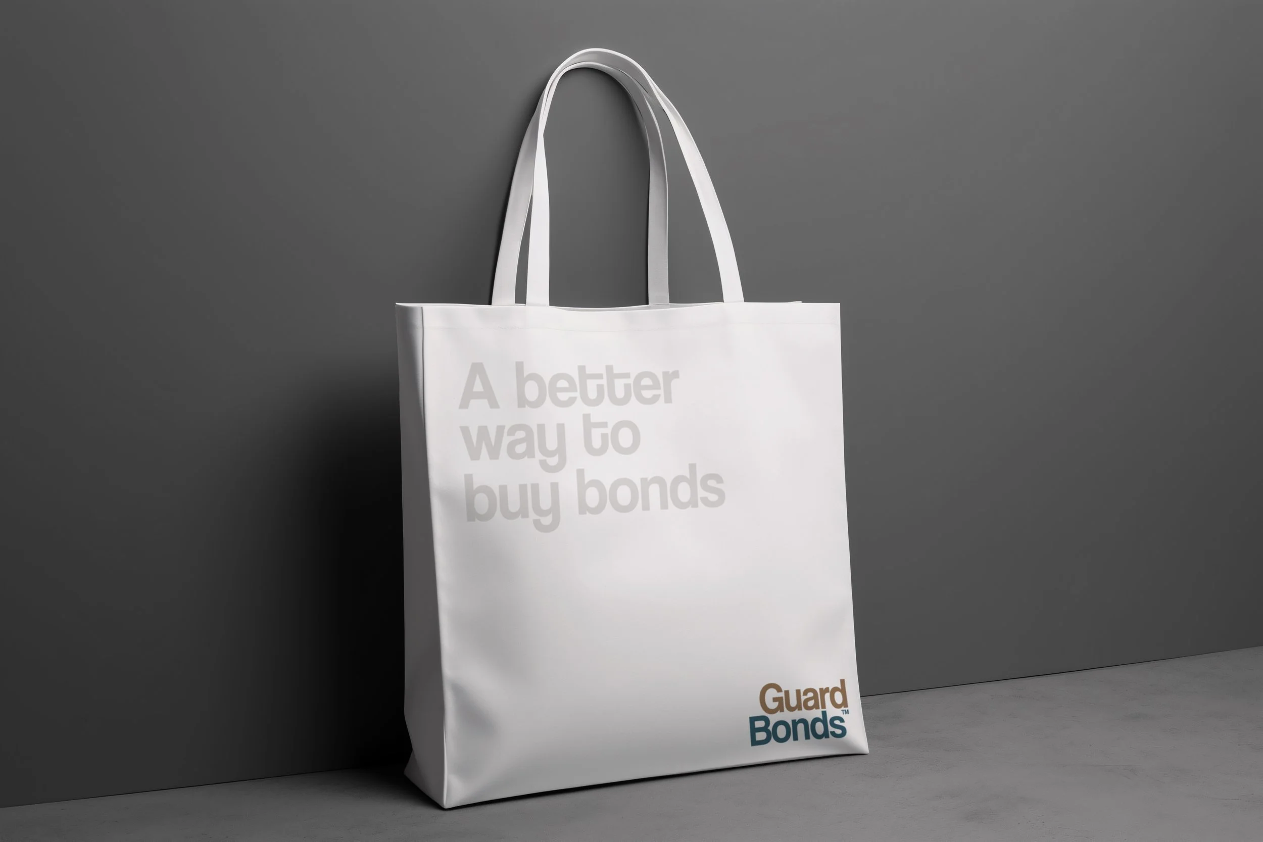
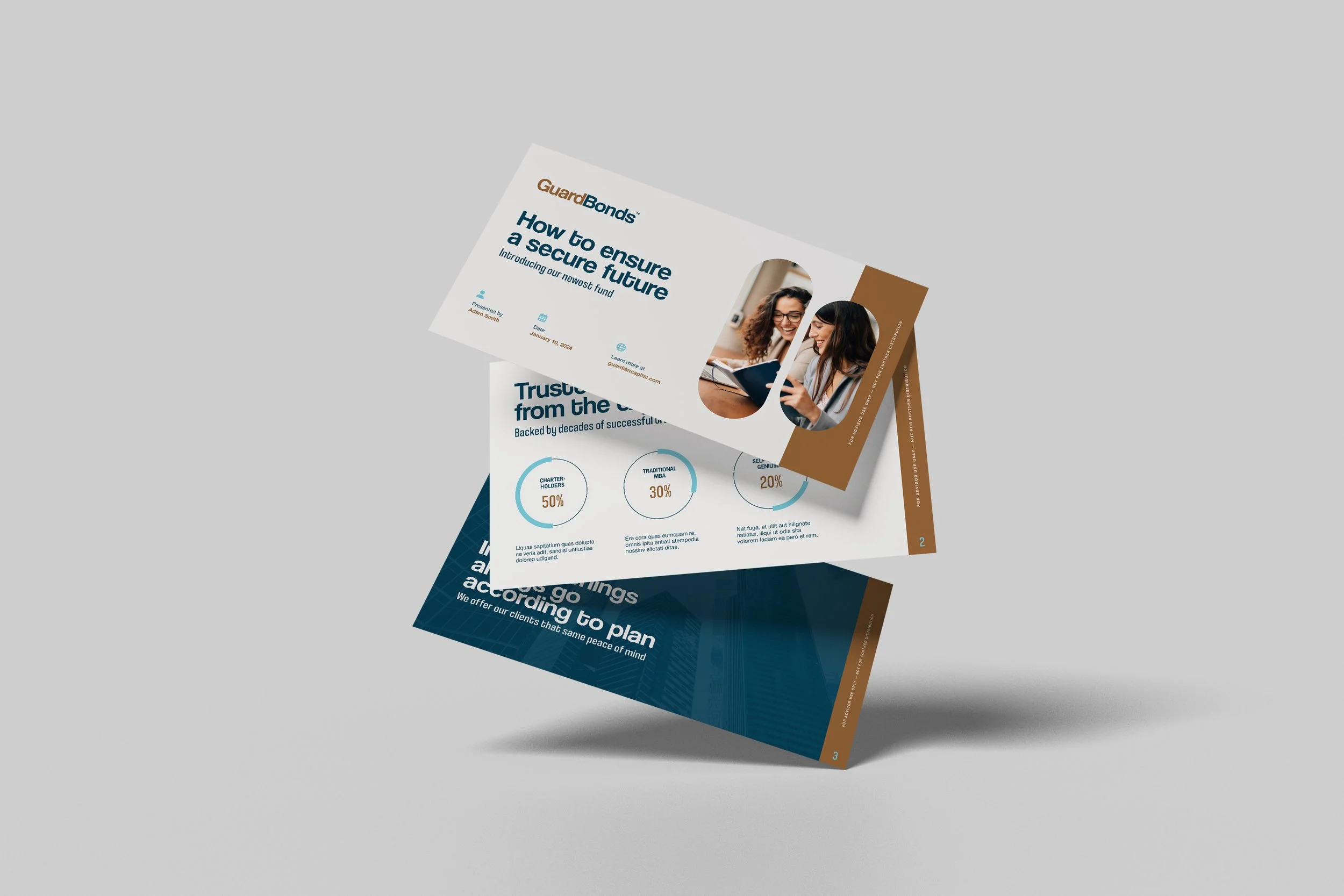
GuardBonds
Investment Fund
Brand Identity
Scope: Brand identity design, marketing materials, presentation and investor assets, and digital brand applications.
Challenge: GuardBonds was launching a new investment fund and required a brand identity that would immediately convey credibility and stability to prospective investors.
Approach: The visual system emphasized clarity and restraint, using structured layouts and a refined colour palette to communicate professionalism and trust. Design applications were created to support investor presentations and marketing materials.
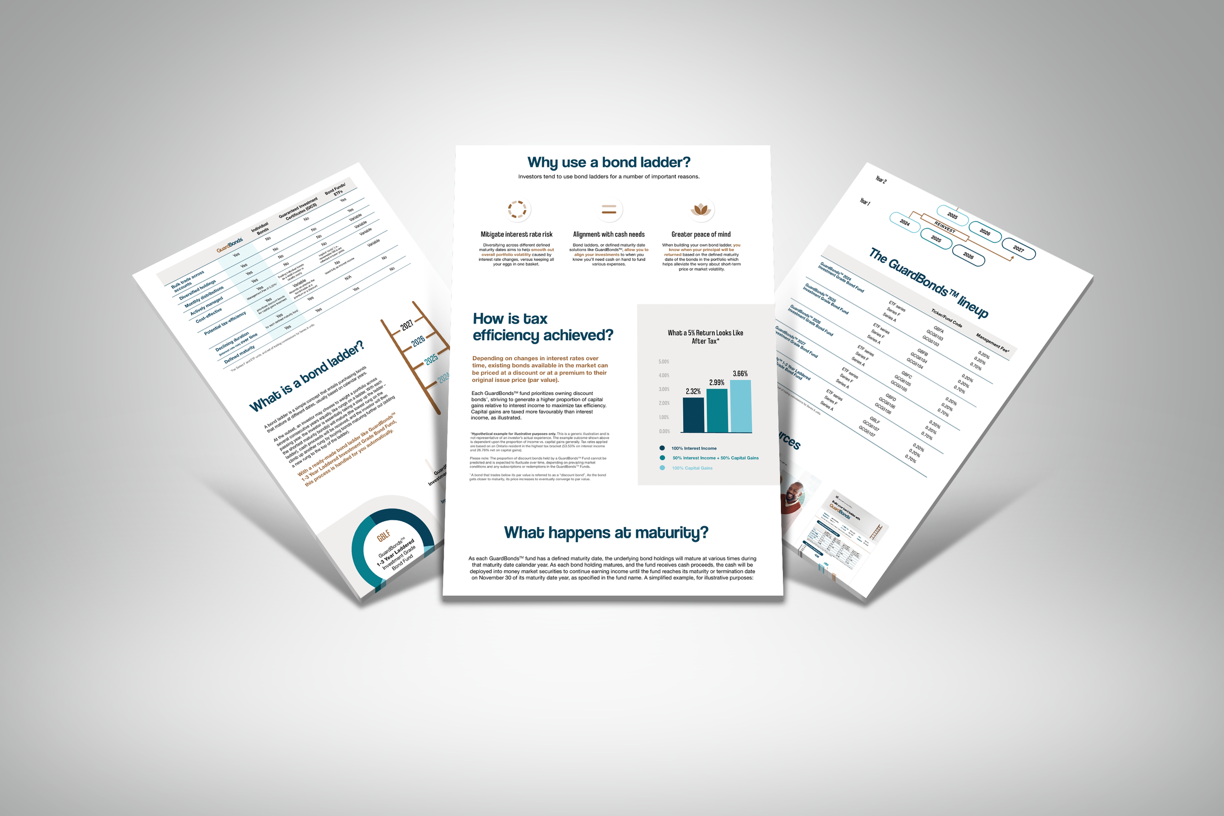
Outcome: The resulting identity provides GuardBonds with a cohesive visual foundation for communicating with investors and partners, helping establish credibility from the outset.
Launching something new that needs immediate credibility?
Thoughtful design can help investment firms present new offerings with clarity, professionalism, and confidence.
-
![Brochure with a photo of two businessmen shaking hands in an office, green background, gold logo, and slogan 'Discover how we can help you achieve financial success'.]()
RaeLipskie
-
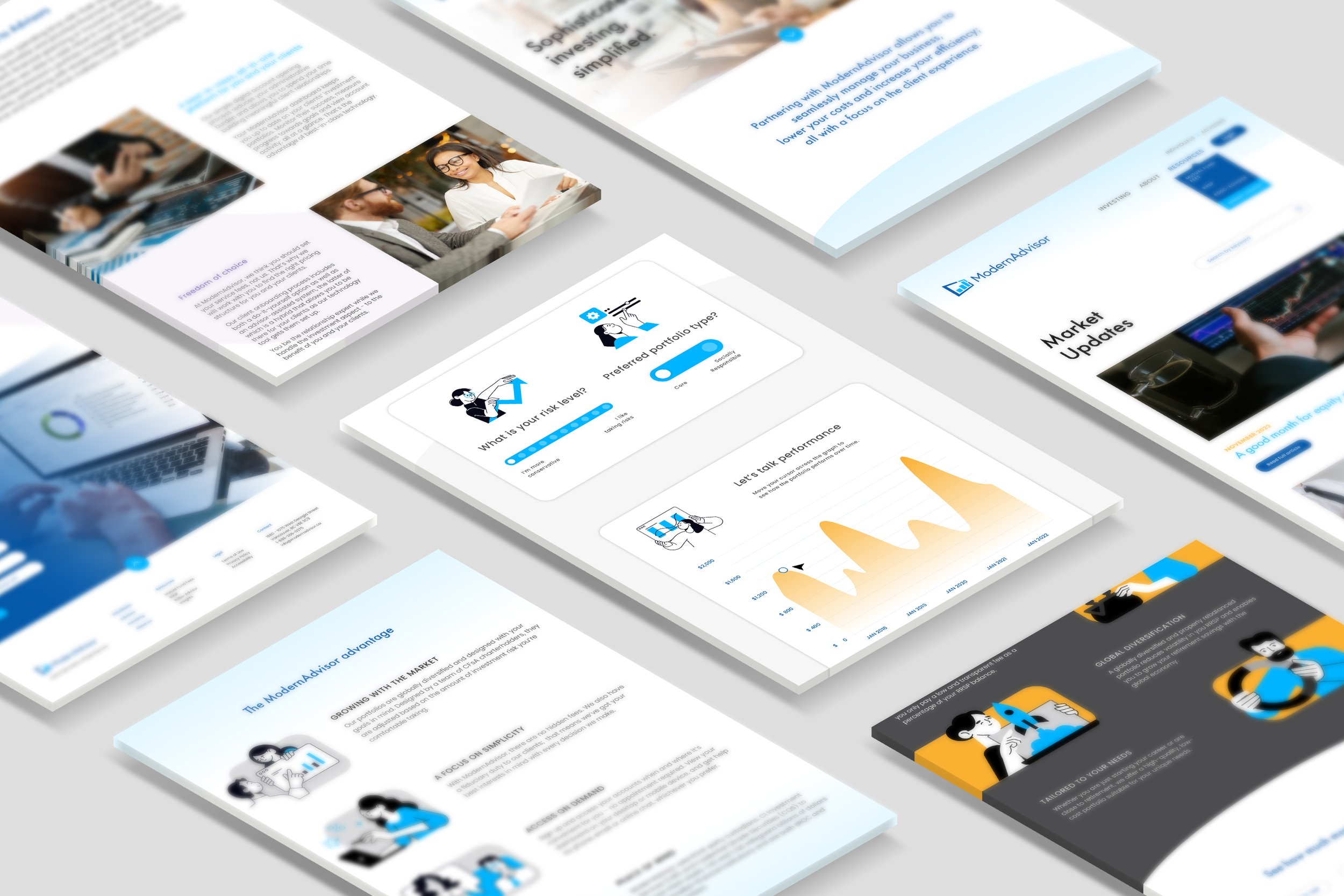
![Multiple digital screens and documents laid out on a surface showing financial and business-themed content, including graphs, charts, and illustrations of people in professional settings.]()
ModernAdvisor
-
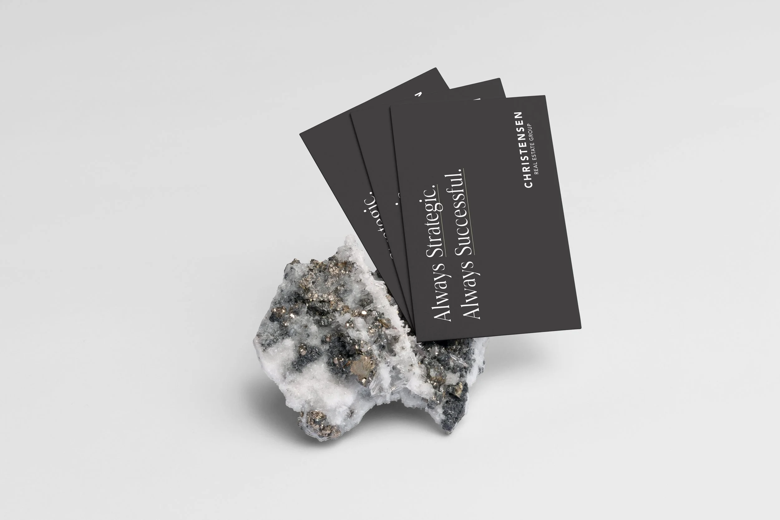
![A cluster of mineral rocks with black, white, and metallic details, supporting four black cards with white text that read "Always Strategic. Always Successful" and "CHRISTENSEN REAL ESTATE GROUP".]()
Christensen
-
![Exhibition booth for Threat IQ with a black backdrop display, a logo and slogan, a curved counter, two white bar stools, a tall standing banner, and a uniquely designed white display stand with digital screens, set on a light background.]()
ThreatIQ